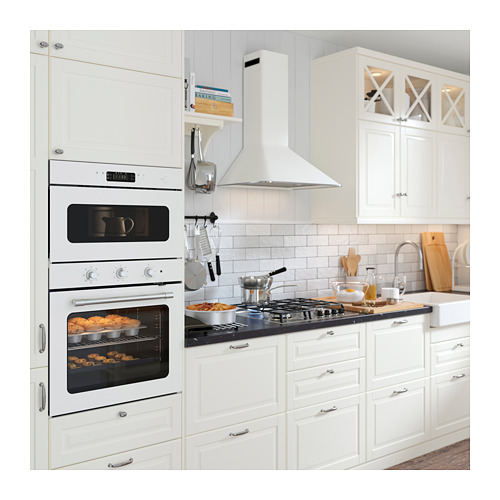
For another fantastic makeover, the IKEA interior designer has taken us to a home of a dancer Beāte who is just as passionate about the interior as she is about dance. She says that the interior is like choreography – a well-executed interior resembles a harmonious dance. The apartment she inherited from her grandmother has been designed with much care and love, allowing Beāte's love for all things retro to show. However, the kitchen has proven to be the hardest part, still exhibiting some 90's charm but without the functionality and comfort that the heart of each home deserves. Our interior designer will need all of her skills to transform this kitchen into a modern haven with a homey retro charm.


Status quo
The kitchen interior in this apartment has remained unchanged since Beāte inherited it from her grandmother. As such, it certainly has its sentimental value but lacks sophistication in function and comfort. A sore point is the height of worktops that have been adjusted to a shorter person and is not exactly comfortable for someone taller.
The missing piece of a puzzle
When creating an interior, a mood board is always a good start, a nice way to organise thoughts and a great brainstorming method. This mood board reveals the character of Beāte, which has both its harmonious and down-to-earth side and the passionate feel for accents in bold colours.
Transformation step 1: the layout
Does the new interior have anything in common with the old one? It certainly does! The interior designer has kept the basics of the layout by arranging the new kitchen in two rows. However, there are some essential differences. For one, a small sitting area has been created. That is great for having a quick bite, resting in-between or just having some company in the kitchen while cooking. Another thing that has changed is the place for the fridge: now it has been moved nearer to the main cooking area to make the layout more ergonomic.


Step 2: the details
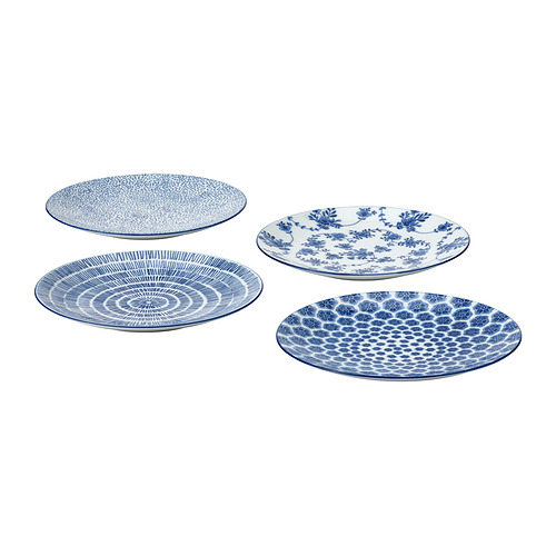
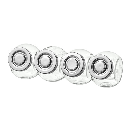
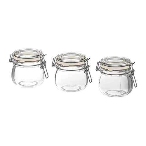
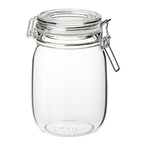
After the furniture has been assembled and is done, it is time to think about details, as details are what give a space its character and personality. Here, the interior designer has opted for some colourful accessories with a retro feel. An affordable and fun way to add colour and texture is to decorate with jars filled with colourful foods.
Step three: the appliances hack
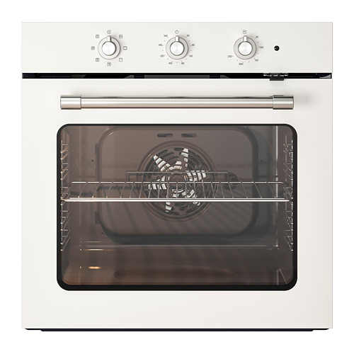
Freestanding fridges tend to take the central stage in many kitchens with their bulk alone. Because of that, she has opted for the subtler built-in version. That is great both for minimalistic interiors and interiors where other decorations are prioritized. Here, there are enough details that show personality, so our interior designer has chosen a simple white solution that blends in with the rest.
Colour as the uniting element
She has chosen a bold blue wall colour that creates a striking contrast with the white furniture and lets the beautiful natural wood tones stand out. Complemented by black details and some red accents, this blue sets the mood for the whole space and acts as the uniting element.
New lower price
New lower price
